1. Budget
A some of money allocated for a particular purpose
2. Project Brief
The out line for an assignment
3. Pantone Colour System
Pantone mixes cyan, magenta, yellow and black, together to create a single color. Each color has a specific number which a printer can look up to determine how the inks should be mixed.
4. Process colour
also known as CMYK
5. Motion Graphics
are graphics that use video and/or animation technology to create the illusion of motion or a transforming appearance.
6. E-Print
is a digital version of a document online
7. Offset Press
An offset press is a sophisticated printing machine designed to produce fine quality reproductions.
Offset presses are used almost exclusively in print shops.
8. Positive and negative space
Positive space
Negative space is the space around and between the subject(s) of an image.
9. Copywriter
is someone who is responsible for an advertisement, verbal and textual elements.
10. Windows and Orphans (type)
windows are the short line at the end of a paragraph and orphans are the short lines at the top of the paragraph
11. Type Foundry
is a company that designs and/or distributes typefaces
12. Type Setter
involves the presentation of textual material in graphic form on paper or some other medium, the role of the typesetter has been largely replaced by the designer or desktop publisher who does the typesetting.
13. Moveable Type
is a system of typography that has moveable components
14. Pica
is a typesetting unit of measurement commonly used for measuring lines of type, 1/6th of an inch or 12 points.
15. Spread
refers to facing or adjacent pages in a layout or adjacent pages laid out for printing.
16. Bleed
When any image or element on a page touches the edge of the page, extending beyond the trim edge, leaving no margin it is said to bleed.
17. Mock-up
is a scale or full-size model of a design or device, used for teaching, demonstration, evaluating a design, promotion, and other purposes.
18. Proof
make or take a proof of, such as a photographic negative, an etching, or typeset
19. Contact Sheet (Photography)
aka contact print, a form made up of the negatives
20. Why don’t we use comic sans?
Because they are ugly and don’t suit.
21. Why don’t we use rainbow gradients?
Because they are ugly and don’t suit.
22. Why don’t we use lens flares?
Because they are ugly and don’t suit.
23. What is a SLR camera?
Single lens reflex camera,
24. Why shoot in RAW?
Because it gives you bigger and better quality photo’s
25. What is an EM?
a unit of measurement in the field of typography, equal to the point size of the current font
26. What is POSTSCRIPT?
is writing added after the main body of a letter, essay, etc
27. What is an EPS? And TIFF?
Encapsulated Post Script is a standard format for saving object-oriented graphics.
Tagged Image File Format is a file format for storing images, including photographs and line art.
28. What is the HSB colour system?
Hue, a particular gradation of color (i.e. the shade or tint of a color)
Saturation, the vividness of hue (the degree of difference from gray)
Brightness, the percentage of brightness of the color.
29. Describe David Carsons work
basic and straight forward but at the same time out their and full, I like it a lot and I think its very modern
30. Desrcibe Alex Trochuts work
very different and detailed, very modern
31. Is the London Olympics logo good
yes and no, its very bright and the colours are way out their but if that’s the look their going for to attract more people then it suits
32. Are you satisfied yet?
Maybe
33. Do some star jumps ☺
We done lots !
Wednesday, November 11, 2009
Sunday, November 8, 2009
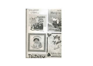
Childrens Story Book


the font i have chosen for the story is "Handform", i chose this font because it is easy to read.
My finished product is as shown...
Wednesday, November 4, 2009
Childrens Story Book
"Lilly and Friends"
Spread One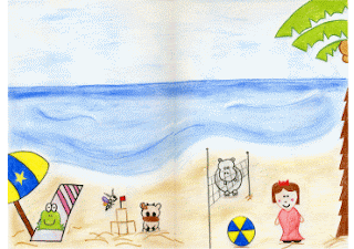
"Lilly and her friends are having lots of fun, untill..."
This spread shows all five character's having fun
at the beach.
i chose different colours for each character to not only make them different from each other but for them to be bright and stand out.
Spread Two/Three -->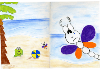
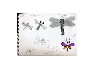
"Fuzzy asks Dizzy to play ball with him, Dizzy trys so hard but she is to little"
"This makes Dizzy very upset"
Thsi spead shows two scenes, main characters Fuzzy Frog and Dizzy Dragonfly again the colours are the same as the first spread.
Spread One

"Lilly and her friends are having lots of fun, untill..."
This spread shows all five character's having fun
at the beach.
i chose different colours for each character to not only make them different from each other but for them to be bright and stand out.
Spread Two/Three -->

"Fuzzy asks Dizzy to play ball with him, Dizzy trys so hard but she is to little"
"This makes Dizzy very upset"
Thsi spead shows two scenes, main characters Fuzzy Frog and Dizzy Dragonfly again the colours are the same as the first spread.
Childrens Story Book
"Lilly and Friends"
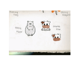
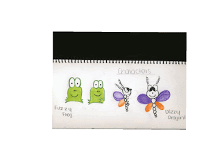
Characters
Story Overview (Spreads)
A group of friends have a day at the beach whilst they are having fun they run into the problem of Dizzy being too little to play with the beach ball, this is very upsetting for Dizzy. In the end Lilly offers her hand and somehow helps Dizzy play and everyone is happy.
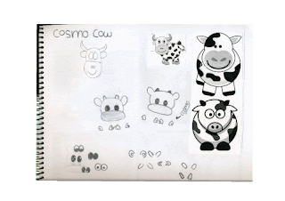
Process
Sketches and Research
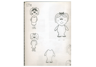
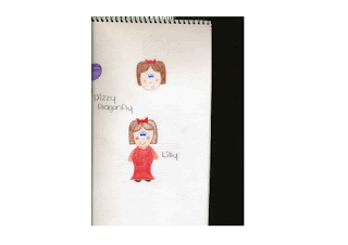
Characters
- Lilly (Little Girl)
- Fuzzy Frog
- Harry Hippo
- Dizzy Dragonfly
- Cosmo Cow
- Lilly and Friends enjoy a sunny day at the beach
- Fuzzy the Frog is relaxing in the shade
- Cosmo the Cow is building a sand castle with Dizzy the Dragonfly
- Harry the Hippo is playing volleyball with Lilly
- Lilly and her friends are having lots of fun, untill...
- Fuzzy asks Dizzy to play ball with him, Dizzy trys so hard but she is to little
- This makes Dizzy very upset
- Lilly sees that Dizzy is sad and offers to be his helping hand, everyone desides to join in.
Story Overview (Spreads)
A group of friends have a day at the beach whilst they are having fun they run into the problem of Dizzy being too little to play with the beach ball, this is very upsetting for Dizzy. In the end Lilly offers her hand and somehow helps Dizzy play and everyone is happy.
Process
Sketches and Research


Thursday, September 24, 2009
cd-soundtrack

finished product -
overall with the three products i am happy, hopefully they will look even better printed in full colour and photograph.

Wednesday, September 23, 2009
Wii & Playstation2 Assignment


I have completed both these, and i am happy with the result. Now im just getting underway with the cd-soundtrack and am very happy how far i have come in a short time.
Sunday, September 20, 2009
Wii & PlayStation2 Assignment

This is the colour scheme i have chosen for the heading for the PS2 game, also i have been working on both of these parts. i have almost finished both, i just have to ad the images and backgrounds which i plan on doing at home and next lesson i plan to get the cd cover underway.
Sunday, September 13, 2009
Wii Assignment

Since the 31st of August i have been generating ideas and have started to produce a final work for the Wii game. I chose to do a 4x4 game called "muddin!", I havnt quite figured out how it actually is ment to run but i have some ideas although i did decide to aim it at the age of 13 to 23.
My typography for the game came from "dafont", i discovered a few such as:
- Iarnold, MB-Rustylron, Comic Andy, Blok, Malgecito, Handform
My aim for next lesson is to start on the image for front and back, hopefully it will work the way i want it to.
Sunday, August 9, 2009
Apply Techniques to produce digital images
The Grass Is Always Greener On The Other Side
My task for this image was “The grass is always greener on the other side” my interpretation of this is out with the old in with the new but back to the old somehow. With two different images merged together I tried to achieve this, the black and white riverside image represents the old days (back then) and the coloured beachside image represents the new (well now). Meaning I believe and think most people would agree that the ways of the old days tend to work better in some situations. I found this task challenging in that thinking of an idea but I think I did a fairly good one.
My task for this image was “The grass is always greener on the other side” my interpretation of this is out with the old in with the new but back to the old somehow. With two different images merged together I tried to achieve this, the black and white riverside image represents the old days (back then) and the coloured beachside image represents the new (well now). Meaning I believe and think most people would agree that the ways of the old days tend to work better in some situations. I found this task challenging in that thinking of an idea but I think I did a fairly good one.
Apply Techniques To Produce Digital Images

Me, Myself and I
For this image I chose a natural scene, a riverside background. I captured this image myself and with the help of a friend I was able to produce ten good self images. By putting these both together I was able to create a digital image with me situated in it ten times, I ran into some problems along the way but with some help was able to fix most of them. I found this image to be the most challenging out of the three, the placing and making it look real was difficult but in the end I just tried.
(the image shows my overall work)
Sunday, August 2, 2009
Apply Techniques to Produce Digital Images

Underwater Scene/Space
For this part of the assignment i chose to do the underwater scene, my theme for this was a basic and natural habitat.
i tried to incorporate as many sea animals as possible and a few other things as well, i found doing this at first a little hard but after a little while i got the hang of things pretty well. I chose to use a vector mask for the cutting and pasting of my objects, i think this is a great technique.
Overall the hardest thing was taking all the pictures into one image and making it look real, well trying to. i think i did a fairly good job of what was asked.
(The image shows my overall work)
Monday, June 8, 2009
GPS Box
Monday 25th May - Thursday 28th May - Monday 1st June
Have been working on digital GPS box and luke has given me some helpful pointers along the way.
Thursday 4th June
Almost finished, just have a few things to fix up (barcode and logo position)
Monday 8th June (Public holiday)
Fixed logo position
Tuesday 9th June
Fixed barcode, now ready to print
Wednesday 10th June
Print digital GPS box and fold in to place
Thursday 11th June
Hand in for marking
Wednesday, May 20, 2009
GPS Box Assignment
Thursday 14th May
Today drew up my analog gps box, completed the the outline and now ready for colour next lesson.
Monday 18th May
Today i coloured my box, i chose three different shades of purple, i completed this and also cut it out and glued it together.
Thursday 21st May
Today i started my digital gps box and going well with it.
Sunday, May 10, 2009
GPS Box Assignment
Monday 11th May 09
Today in class i sketched all sides of my box and also sketched two templates, one with the measurements and what size it would be 15cm x 15cm (square) and one in the colour's i have chosen.
Today in class i sketched all sides of my box and also sketched two templates, one with the measurements and what size it would be 15cm x 15cm (square) and one in the colour's i have chosen.
- Mostly Black writting, inc white aswell
- Different shades of purple for the actual colour
- Silver and Black for the GPS
- Front - The Trek-Man TM-90
- Top (lid) - Trek-Man logo, Website and Catch Phrase " Explore with Trek-Man " and BONUS! Free wall charger
- Right Side - Model Number TM-90, and back of GPS
- Left Side - Value Pack (Contents)
- Back - Extras and Buttons
- Bottom - Important Notes, Company (Explore), Map Data Coverage and Barcode
GPS Box Assignment
Sunday 10th May 09
Tooday, whilst at home i created button icons for my GPS .
Including . . .
Tooday, whilst at home i created button icons for my GPS .
Including . . .
- Menu Button, reveals all on the touch screen
- Map " , reveals trevel route
- Fuel " , reveals guage and how many km's untill empty also nearest fuel station
- Speed and Safety Camera " , revels where abouts roughly
- Volume " , change the tone of the speakers voice
Wednesday, May 6, 2009
GPS Box Assignment
Thursday 7th May 09
Today i created a small (not to size) paper model of my GPS box, just to get an idea of what the finished product could be like.
Also, Sketches of a "Trek-man" GPS. Including other sketches of icon buttons and where to place them best.
Decided on a company name, "Explore" and took notes on what information to place on the GPS box.
At home and next lesson i would like to create another model but of equal and proper size.
Sunday, May 3, 2009
GPS Box Assignment
Monday 4th May 09
Brainstorming of company names
- Global and Explore
Brainstorming of logo names , narrowed down to Two
- Trek-man and Set Out
Final idea of logo names, "Trek-man"
- Sketched, Ink drawn and Attemptd to be computer made
Brainstorming of company names
- Global and Explore
Brainstorming of logo names , narrowed down to Two
- Trek-man and Set Out
Final idea of logo names, "Trek-man"
- Sketched, Ink drawn and Attemptd to be computer made
GPS Box Assignment
Thursday 30th April 09
Brainstorming of logo names
- Helsman, Steersman,Pilot and wheelman
- Tour, Trek, Walk, Drive, Driving, Make One's Way, Trotting and Voyage
- Seeman, Trek-man, Smartman, World, Global, Explore, Hunt, Tracing, All around the world, Universal and Setout
Rough sketches drawn of differnet logo names
- Seeman
- Smartman
- Trek-man
- Set Out
Brainstorming of logo names
- Other names for "Navigator"
- Helsman, Steersman,Pilot and wheelman
- Other names for "Travel"
- Tour, Trek, Walk, Drive, Driving, Make One's Way, Trotting and Voyage
- Idea Names
- Seeman, Trek-man, Smartman, World, Global, Explore, Hunt, Tracing, All around the world, Universal and Setout
Rough sketches drawn of differnet logo names
- Seeman
- Smartman
- Trek-man
- Set Out
Tuesday, February 24, 2009
Colour Psychology In Western Society
Red ! - Is Hydrogen, it stirs the senses and passions accociated with will power and excitement of life.
- Emotion Level - Negative - Anger - Positive - Happiness and Love
- Spirtual Level - Sacrifice (blood) survival and re-birth
Examples - Valentines Day, a day of red and love between people
- Traffic lights and Road signs meaing STOP
Orange ! - Is Aluminum, Calcium, Silicon and Copper
- Emotion Level - Negative - being nervous and restless - Positive - stimulates creativity and ambition along with energectic activity.
- Spirtual Level - preservation of oneself
Example - Many Fruits and Vegies are orange making this the colour of nourishment
- Traffic lights, Road signs, Safety for workers and also advertising

Yellow ! - Is Iron, Sulphur, Carbon, Sodium and Magnesium
- Emotion Lavel - Negative - can cause mental irritation and destructiveness - Positive - Joy, Peace, Rest, Sunshine... etc
- Spirtual Level - Sacred to East Society
Example - It makes a dull room bright, a good colour for a kitchen. Yellow fruits and vegies tend to act as a laxative to the bowl and calm the nerves. also road signs.

Purple ! - Is a combination of Red and Blue
- Emotion Level - Negative - overwhelm - Positive - Good Imagination
- Spirtual Level - here to be of service, represents good motives
Example - Symbol of royalty and authority, a purple robe.
Green ! - is Notrogen and Chlorine .
- Emotional Level - Negative - selfishness, jealousy and laziness - Positive - Natures Colour ! its soothing, healing, peaceful and cool
- Spiritual Level - Healing power
Example - Nature, its all around
Pink ! - is enlightening red and relates to the heart
- Emotional Level - soft, gentle and caring
- Spiritual Level - innocence of a child (girl)
Example - Pink is a good colour to use in bedrooms as it is peaceful and restful
Blue ! - is the colour most preferred by men
-Emotional Level - Positive - Peaceful and calm - Negative - Depressing
-Spiritual Level - A colour to treat pain
Example - Blue is the colour of the sky and the ocean

Black ! - is real sensation
-Emotional Level - Death and Mourning
-Spiritual Level - Menace or Evil
Example - Black is also a good choice to wear as a clothing item because it is slimming.

White ! - is bright and can create a sense of space or add highlights.
-Emotional Level - represents purity or innocence.
-Spiritual Level - as fierce as red, as definite as black...God paints in many colours.
Example - white is the symbol of a bride at her wedding, it is important for her to wear white as traddition.
Gold ! - is an intense version of yellow
- Emotional Level - Joy and Happiness
- Spiritual Level - Wisdom
Example - Gold is of value - $
Brown ! - is a natural colour
- Emotional Level - Positive - Strength and comfort - Negative - Isolation and sadness
- Spiritual Level - Reliability
Example - Brown is earth
Grey ! - is independence
-Emotional Level - Positive - Self-reliance - Negative - Non-commitment
-Spiritual Level - ?
Example - Grey is the colour of rain cloud
Silver ! - is the element Air.
-Emotional Level - Positive - Soothing and calm
- Spiritual Level - Mentally cleansing
Example - Silver represents the moon
- Emotion Level - Negative - Anger - Positive - Happiness and Love

- Spirtual Level - Sacrifice (blood) survival and re-birth
Examples - Valentines Day, a day of red and love between people
- Traffic lights and Road signs meaing STOP

Orange ! - Is Aluminum, Calcium, Silicon and Copper
- Emotion Level - Negative - being nervous and restless - Positive - stimulates creativity and ambition along with energectic activity.
- Spirtual Level - preservation of oneself
Example - Many Fruits and Vegies are orange making this the colour of nourishment
- Traffic lights, Road signs, Safety for workers and also advertising

Yellow ! - Is Iron, Sulphur, Carbon, Sodium and Magnesium
- Emotion Lavel - Negative - can cause mental irritation and destructiveness - Positive - Joy, Peace, Rest, Sunshine... etc
- Spirtual Level - Sacred to East Society
Example - It makes a dull room bright, a good colour for a kitchen. Yellow fruits and vegies tend to act as a laxative to the bowl and calm the nerves. also road signs.

Purple ! - Is a combination of Red and Blue
- Emotion Level - Negative - overwhelm - Positive - Good Imagination
- Spirtual Level - here to be of service, represents good motives
Example - Symbol of royalty and authority, a purple robe.
Green ! - is Notrogen and Chlorine .

- Emotional Level - Negative - selfishness, jealousy and laziness - Positive - Natures Colour ! its soothing, healing, peaceful and cool
- Spiritual Level - Healing power
Example - Nature, its all around
Pink ! - is enlightening red and relates to the heart

- Emotional Level - soft, gentle and caring
- Spiritual Level - innocence of a child (girl)
Example - Pink is a good colour to use in bedrooms as it is peaceful and restful
Blue ! - is the colour most preferred by men

-Emotional Level - Positive - Peaceful and calm - Negative - Depressing
-Spiritual Level - A colour to treat pain
Example - Blue is the colour of the sky and the ocean

Black ! - is real sensation
-Emotional Level - Death and Mourning
-Spiritual Level - Menace or Evil
Example - Black is also a good choice to wear as a clothing item because it is slimming.

White ! - is bright and can create a sense of space or add highlights.
-Emotional Level - represents purity or innocence.
-Spiritual Level - as fierce as red, as definite as black...God paints in many colours.
Example - white is the symbol of a bride at her wedding, it is important for her
 to wear white as traddition.
Gold ! - is an intense version of yellow
- Emotional Level - Joy and Happiness
- Spiritual Level - Wisdom
Example - Gold is of value - $
Brown ! - is a natural colour

- Emotional Level - Positive - Strength and comfort - Negative - Isolation and sadness
- Spiritual Level - Reliability
Example - Brown is earth
Grey ! - is independence
-Emotional Level - Positive - Self-reliance - Negative - Non-commitment

-Spiritual Level - ?
Example - Grey is the colour of rain cloud
Silver ! - is the element Air.

-Emotional Level - Positive - Soothing and calm
- Spiritual Level - Mentally cleansing
Example - Silver represents the moon
Tuesday, February 17, 2009
Wednesday, February 11, 2009
Five GREAT Designs
#1 . -I Lost My Patience-
I like this image because it shows what its trying too say the meaning in the image stands out to me when i look at it .
#2 . -Im Selling Colours-
I belive this image relates too me because i love bright colours and the way it been down is eye catching .
#3 . -Disco Disco-
This picture is sharp and vibrant . It stood out too me when i looked at it because again like "im selling colours" its just eye catching due to its colour choice .
#4 . -Months In Lamp Light-
A picture that has a way of expressing the truth through it view "lamp light" shows too me when i look at it what it would be like if we lived in a place that was only viewed by light from a lamp its an unusal way of looking at life this way .
#5 . -Graphic Manila-
This picture shows too me lots of choas and just very busy in general .
Tuesday, February 10, 2009
Monday, February 9, 2009
Sunday, February 8, 2009
Simply Random ! !
Heeeeey
I found this on QBN Simply Random
If your intoo the whole taking random photo's or looking at them like mee then you will enjoy them .
Check it out
Catch ya x
I found this on QBN Simply Random
If your intoo the whole taking random photo's or looking at them like mee then you will enjoy them .
Check it out
Catch ya x
Subscribe to:
Posts (Atom)