1. Budget
A some of money allocated for a particular purpose
2. Project Brief
The out line for an assignment
3. Pantone Colour System
Pantone mixes cyan, magenta, yellow and black, together to create a single color. Each color has a specific number which a printer can look up to determine how the inks should be mixed.
4. Process colour
also known as CMYK
5. Motion Graphics
are graphics that use video and/or animation technology to create the illusion of motion or a transforming appearance.
6. E-Print
is a digital version of a document online
7. Offset Press
An offset press is a sophisticated printing machine designed to produce fine quality reproductions.
Offset presses are used almost exclusively in print shops.
8. Positive and negative space
Positive space
Negative space is the space around and between the subject(s) of an image.
9. Copywriter
is someone who is responsible for an advertisement, verbal and textual elements.
10. Windows and Orphans (type)
windows are the short line at the end of a paragraph and orphans are the short lines at the top of the paragraph
11. Type Foundry
is a company that designs and/or distributes typefaces
12. Type Setter
involves the presentation of textual material in graphic form on paper or some other medium, the role of the typesetter has been largely replaced by the designer or desktop publisher who does the typesetting.
13. Moveable Type
is a system of typography that has moveable components
14. Pica
is a typesetting unit of measurement commonly used for measuring lines of type, 1/6th of an inch or 12 points.
15. Spread
refers to facing or adjacent pages in a layout or adjacent pages laid out for printing.
16. Bleed
When any image or element on a page touches the edge of the page, extending beyond the trim edge, leaving no margin it is said to bleed.
17. Mock-up
is a scale or full-size model of a design or device, used for teaching, demonstration, evaluating a design, promotion, and other purposes.
18. Proof
make or take a proof of, such as a photographic negative, an etching, or typeset
19. Contact Sheet (Photography)
aka contact print, a form made up of the negatives
20. Why don’t we use comic sans?
Because they are ugly and don’t suit.
21. Why don’t we use rainbow gradients?
Because they are ugly and don’t suit.
22. Why don’t we use lens flares?
Because they are ugly and don’t suit.
23. What is a SLR camera?
Single lens reflex camera,
24. Why shoot in RAW?
Because it gives you bigger and better quality photo’s
25. What is an EM?
a unit of measurement in the field of typography, equal to the point size of the current font
26. What is POSTSCRIPT?
is writing added after the main body of a letter, essay, etc
27. What is an EPS? And TIFF?
Encapsulated Post Script is a standard format for saving object-oriented graphics.
Tagged Image File Format is a file format for storing images, including photographs and line art.
28. What is the HSB colour system?
Hue, a particular gradation of color (i.e. the shade or tint of a color)
Saturation, the vividness of hue (the degree of difference from gray)
Brightness, the percentage of brightness of the color.
29. Describe David Carsons work
basic and straight forward but at the same time out their and full, I like it a lot and I think its very modern
30. Desrcibe Alex Trochuts work
very different and detailed, very modern
31. Is the London Olympics logo good
yes and no, its very bright and the colours are way out their but if that’s the look their going for to attract more people then it suits
32. Are you satisfied yet?
Maybe
33. Do some star jumps ☺
We done lots !
Wednesday, November 11, 2009
Sunday, November 8, 2009
Childrens Story Book
Wednesday, November 4, 2009
Childrens Story Book
"Lilly and Friends"
Spread One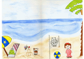
"Lilly and her friends are having lots of fun, untill..."
This spread shows all five character's having fun
at the beach.
i chose different colours for each character to not only make them different from each other but for them to be bright and stand out.
Spread Two/Three -->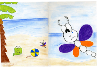
"Fuzzy asks Dizzy to play ball with him, Dizzy trys so hard but she is to little"
"This makes Dizzy very upset"
Thsi spead shows two scenes, main characters Fuzzy Frog and Dizzy Dragonfly again the colours are the same as the first spread.
Spread One

"Lilly and her friends are having lots of fun, untill..."
This spread shows all five character's having fun
at the beach.
i chose different colours for each character to not only make them different from each other but for them to be bright and stand out.
Spread Two/Three -->

"Fuzzy asks Dizzy to play ball with him, Dizzy trys so hard but she is to little"
"This makes Dizzy very upset"
Thsi spead shows two scenes, main characters Fuzzy Frog and Dizzy Dragonfly again the colours are the same as the first spread.
Childrens Story Book
"Lilly and Friends"
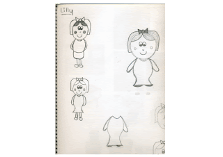
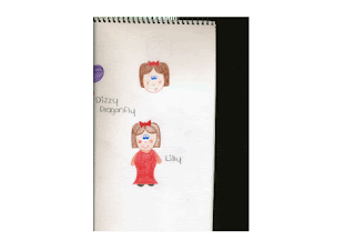
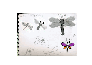
Characters
Story Overview (Spreads)
A group of friends have a day at the beach whilst they are having fun they run into the problem of Dizzy being too little to play with the beach ball, this is very upsetting for Dizzy. In the end Lilly offers her hand and somehow helps Dizzy play and everyone is happy.
Process
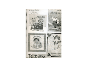
Sketches and Research
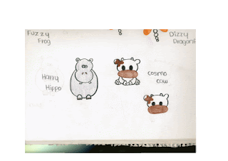
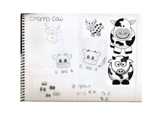
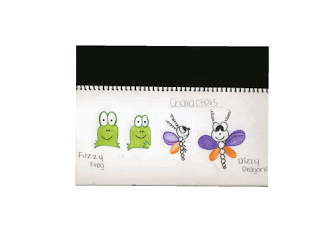
Characters
- Lilly (Little Girl)
- Fuzzy Frog
- Harry Hippo
- Dizzy Dragonfly
- Cosmo Cow
- Lilly and Friends enjoy a sunny day at the beach
- Fuzzy the Frog is relaxing in the shade
- Cosmo the Cow is building a sand castle with Dizzy the Dragonfly
- Harry the Hippo is playing volleyball with Lilly
- Lilly and her friends are having lots of fun, untill...
- Fuzzy asks Dizzy to play ball with him, Dizzy trys so hard but she is to little
- This makes Dizzy very upset
- Lilly sees that Dizzy is sad and offers to be his helping hand, everyone desides to join in.
Story Overview (Spreads)
A group of friends have a day at the beach whilst they are having fun they run into the problem of Dizzy being too little to play with the beach ball, this is very upsetting for Dizzy. In the end Lilly offers her hand and somehow helps Dizzy play and everyone is happy.
Process
Sketches and Research


Thursday, September 24, 2009
cd-soundtrack
Wednesday, September 23, 2009
Wii & Playstation2 Assignment
Sunday, September 20, 2009
Wii & PlayStation2 Assignment
Subscribe to:
Comments (Atom)


